VDizzle12
-
Posts
5 -
Joined
-
Last visited
Content Type
Profiles
Forums
Events
Gallery
Blogs
Everything posted by VDizzle12
-
UA Athletics has been using the same Pantone color swatches since the original redesign in 2002. Different applications and lighting tend to give different effects. The blue on the turf is the same as the blue in the JAR. It just looks brighter because of the sunlight. Can't outline the A logo in gold in either application. Gold on a green field and gold on a tan basketball court just doesn't look right. There's not enough contrast. The white outline makes the most sense.
-
I worked in the athletic department back in the 2010s and Gerry was one of the nicest people I met. He was always walking around talking to everyone. He had some great stories from his time at Notre Dame and was always so grateful for his coaching opportunities.
-
3 wins?
-
Glad all those days sitting in Folk Hall finally paid off.
-
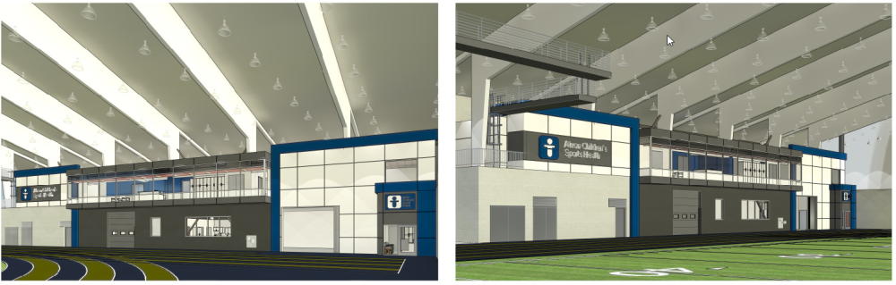
The work at the fieldhouse's new Akron Children's Sports Health Center is coming along. Didn't even realize this was happening. Looks like it will be pretty cool when done.