Leaderboard


Popular Content
Showing content with the highest reputation on 05/11/2022 in Posts
-
Agree 100%. Most college logos are simple letterforms. But have been around so long that nobody really thinks about it anymore. The new A would be one of the top logos in a lot of conferences. Just because it's different than what we're used to, doesn't mean it's bad.4 points
-
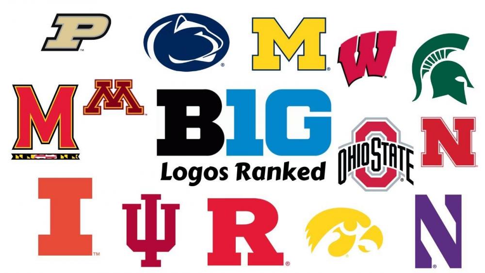
As I continue to warm up to the new logo I wanted to make one more point. Most logos, especially one letter logos, become identifiable over time. Check out the Big 10 logos. Honestly, most are very boring and unimaginative. In my mind the new A is easily as good or better than Nebraska, Purdue, Rutgers, Wisconsin, Maryland, Michigan, Nebraska, and Illinois. Debatable vs Ohio State, Minnesota, Indiana and Northwestern. Less imaginative vs Iowa, Michigan State and Penn State. Bottom line, win some MAC championships and bowl games and it will look much better.
 4 points
 -
If he elects to become a Zip, I hope he gets it together. If he becomes a Zip and does not nail down the starting job, my Magic 8 Ball says to expect trouble.3 points
-
I check it daily for any basketball transfer news.2 points
-
I looked. I especially like all 9 of the logos that incorporate the teams mascot better than our hidden-Z logo.2 points
-
Anyone who still hates the new logo needs to see this page. Look at the rest of the MAC. The Zips easily have the nicest, most professional looking logo out of that whole group.2 points
-
It's not that we had 9 logos in history, we had 9 different marks introduced as a set in the 2000s. Z logo, full kangaroo, kangaroo head, primary kangaroo head with A, etc. For one school that is a LOT. It prevents you from having one unique mark that every recognizes as Akron. This is what the new logo accomplishes. It's simple, clean and unique enough to become iconic. I hated it first. It's different and especially a hard adjustment for a school recognized by it's unique mascot. But at the end of the day, a big chunk of the major schools in the country are most known for a simple letter mark like this. Notre Dame, Alabama, Oklahoma, Georgia, UNC, Duke, etc. Of course most schools have a mascot marks, but I see no reason why Akron can't have Zippy stick around in a minor role like the ND fighting Irishman or Alabama's elephant.2 points
-
IF they replace the old floor, or at least replace the logo. Something they haven't done in at least three logos. It's certainly not the worst, and not really the best. I still like the pissedoff Roo logo on my posts, but they wanted ONE logo, one vision for the entire university. Not just the athletics department. It has to look unique and catchy to prospective students in all of the programs. They are the ones the University has to attract. Not sports fans.1 point
-
I’m salivating for the gold hoodie and navy polo they teased on Twitter. Come on UA!!!!1 point
-
I like the new logo. I particularly like how it works with the 'Akron' beneath it, forming a nice structure that fits together as a unified visual element. It feels unique to me and clean, a refreshing update but some on a traditional elements. I don't know if it will stand the test of time- may not prove to be 'timeless'- but I at least like that what it is signaling right now.1 point
-
I would like Arizona’s A better if it were just the red A ^^. Ours is better 💯💪😤1 point
-
On my phone now, but the RubberDucks are already using the new A in their advertisement of the Zips game at Canal Park next Monday evening vs. Georgia Tech. No cost for admission. Sounds like fun!1 point
-
It just seemed funny to me that the latest Zips Headline is 1472 days old.1 point
-
Definitely not the site of choice for the "latest" Zips news.1 point
-
VerbalCommits dot com is using our new logo already 💪1 point
-
Just made this my profile pic. The more I look at this, the more I believe they need to make the subtle change of adding the line(s) to highlight the Z in the logo. It adds that special flare that helps make it identifiable with the University of Akron Zips.1 point
-
Great post. I LOVE the new A. It strikes me as an adult logo. Grown up. Serious. Big time; not at all minor league.1 point
-
I like it! Well done. Like how they incorporated the Z into the A.1 point
-
I laughed when I saw your name. We should put 3rd&twenty on our helmets. More people probably connect that with Akron football than anything else. An "A" of some sort is not what I'm looking for. It could mean any number of things. Be clear about who and what you are. No confusion.1 point