


akzipper
-
Posts
2,557 -
Joined
-
Last visited
-
Days Won
18
Recent Profile Visitors
10,164 profile views






akzipper's Achievements






-
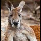
The Roo logo is cool, but it definitely needs something under it or else it just looks like everything under his eyes is randomly cut off. The logo was done right before I started working in the athletic department. If I remember correctly it was originally designed as a full head, cropped for the "Fear the Roo" text. I had a file that showed the full head/face. I wish they would have decided to bring back the two side profile kangaroos instead.
-

Week #3 - Minnesota Preview & Game Thread
akzipper replied to catdaddyp's topic in Akron Zips Football
Same. BTN Overflow at noon. -
It's hilarious to me how much OSU fans complain about everything Oregon. They literally hated Dillion Gabriel up in Cleveland from day 1 and were booing him last season. All because he beat them once, got drafted instead Will Howard and swept all the Big Ten awards.
-
Good point. I actually forget sometimes about Oregon. I used to root for Michigan just because of how much OSU fans hate them. But not after the past few years. Now they are just the lesser of two evils.
-
I hate every single team in the Big Ten and always will.
-
I wonder if the national company was trying to ride the wave of hype surrounding the OC promotion. Then saw how quickly it died down after a "celebrity" wasn't chosen and backed out. As Zips fans we think it's great that one of us made the cut. But nobody outside really cares anymore.
-
I agree completely. I'm really happy it wasn't McAfee, but Big Cat seems like an okay dude. As far as Barstool goes at least. He'll give us a ton of publicity. Not only now but for the foreseeable future as it really is a once-in-a-lifetime opportunity. I'm hoping this brings in a lot of excitement for the home opener and I'm strongly considering heading to the game myself with my boys. We aren't local, but I've been meaning to get them back for a game. Hopefully the casual fans around Akron are excited too.
-
Well I think we're pretty gutted right now. Both because of graduations and transfers, so we can't say the program is better off now that when we he showed up. But he did have more success than KD.
-
I have a saved eBay search for "Akron Zips Nike" that I check out every week or so. It's my go-to for all my Zips gear now. Tons of team issued stuff shows up on there. I'm assuming it's all surplus that the players and coaches didn't need. But I have gotten an awesome Zips Football hoodie, a game worn football jersey, Akron/LBJ basketball quarter zip and two other Akron Nike pullovers. All came brand new with tags and everything.
-
The Cavs seem to be spiraling into a rebuild. Maybe if they choose to go younger they can finally bring him back home.
-
This one hurts. I will never forgive John for poaching our guys.
-
Nailed it.
-
$350k after 5 years to put towards a new arena. That should cover most of it.
-
Just the state of the internet nowadays. People will complain about EVERYTHING. It's exhausting.
-
I remember a group of KD's players were at Groce's introductory press conference. I was super bummed at the time and honestly that gave me a little bit of hope. Pretty sure they all transferred lol.