Leaderboard


Popular Content
Showing content with the highest reputation on 07/30/2021 in Posts
-
The gold Z on the white helmet was SICK!!!
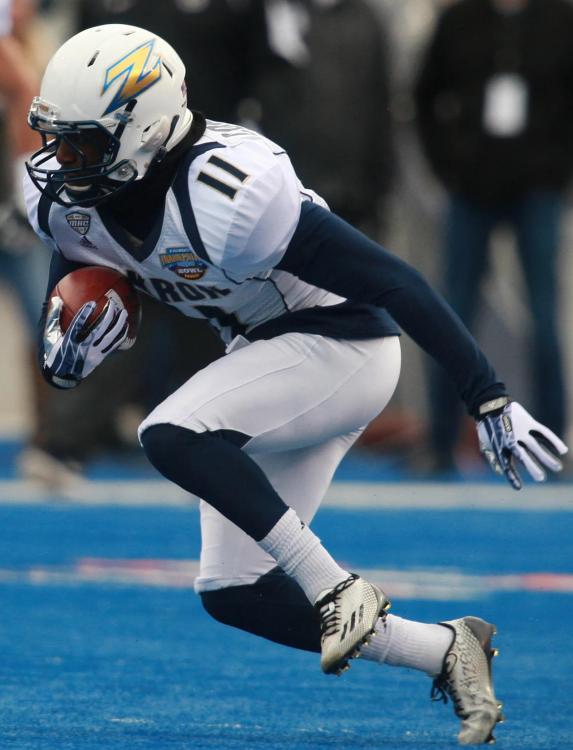 2 points
 -
Loved that uni. I wish they would bring it back.1 point
-
I agree.1 point
-
Maybe I'm in the minority, but I think the cursive "Akron" is the worst. Not sure why it's basically being used as a primary logo now across all sports. It's boring and generic. Especially when we already have two very cool unique logos that are almost never used anymore.1 point
-
He's a fine player and he'll get drafted. I just don't see him as much of an NBA player. I hope I am wrong.1 point