Leaderboard


Popular Content
Showing content with the highest reputation on 05/07/2022 in all areas
-
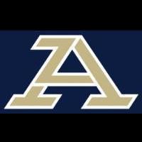
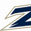
Like others I've seen the proposed new logo. I can't say much about it because I gave my word that I would give feedback, but not disclose the design. I'll offer these comments though. First, the process is professional and in depth. This goes beyond sports and seeks to unify UA's branding across all media sources. We have too many logos and we need to standardize on one. Second, a decision will be made soon. We are talking days here, not weeks. Third, there are many different constituencies that have been consulted: faculty, alumni, community (fans), businesses, media consultants and board of trustees. All have opinions. None are overwhelmingly in favor of one particular design. In short, expect many people won't be happy. What emerges will be unique and have the potential to become iconic. Fourth, my favorite, the Z, does not say Akron and that is a concern. There is some history here that I can't go into, but the bottom line is that the word Akron or an A is the focus right now. Script Akron is recognized as needing work, but it is considered valuable and it will be on some uni's as a secondary logo. The same is true of the Z. It will not be primary, but in certain uni schemes it will appear. That being said the new logo will be primary for all uniforms. Finally, whatever is chosen it seems many on this board will not be happy, based on previous posts. The U can't let that paralyze them and be afraid to make a change. Months of research and consultation has gone into this decision. We need to solidify our branding. You might not get what you want but this too shall pass. If we keep winning and have an identity that means Akron, we will be OK.4 points
-
The Z logo is perfect imo. I get recognition all over Charlotte and even when i went to Charleston. No other school has it, tons of schools have U and A2 points
-
Which are two of the most unique nicknames/mascots in college athletics. Utilize that.2 points
-
https://www.instagram.com/p/CdQ24odN5cj/?igshid=YmMyMTA2M2Y=1 point
-
1 point
-
Comic Sans. 😂 I'll mention again, I like the Script Akron on the front of baseball & basketball jerseys. It's classic. Since it's pulled straight off a Nike website it's just not appropriate as a primary logo for a D-1 school.1 point
-
A security update was run today. If there are any issues, report them here.1 point
-
Lemme loop in Mark Kostelac. He knows all about Khadim's right cross.1 point
-
The nature of the event made is really tough to make any detailed evaluations. First...it began early? I arrived a little before 3 pm and had missed the first 10 game minutes. 🙁 The clock ran quickly...no commercial breaks...nuthin'. If you blinked, you missed a play. No video replay screen. You got one look at a play, and it was at the field-level view of the field house stands. Upper deck of InfoCision would have been much nicer. I was constantly flipping through my phone roster trying to match up new players numbers to their names. It'll be more informative to attend some of the August practices and scrimmages. I will definitely try to hit some.1 point
-
Been done. Sucks just as bad as script Akron.0 points