Leaderboard


Popular Content
Showing content with the highest reputation on 05/12/2022 in all areas
-
I saw Marcus Moore picked up offers to at least Liberty and Marshall in recent days. Hope we can keep him as well.3 points
-
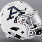
I'll like the logo a whole lot more if I see it on a helmet in a bowl game. In all honesty, it is growing on me.3 points
-
Very true. I also read an article that Wasel has formed a great relationship with Moorhead over the past year or two, so hopefully that continues and keeps him wanting to be a Zip. I think he could be a great QB for the Zips and help us as we continue to move forward in what seems like a very promising era.2 points
-
We’ve definitely picked up some good ones early. No doubt they’ll continue to receive attention and land more offers throughout the year. Our commits could always shut it down and tell everyone else they aren’t interested, but why would they do that? Especially in today’s world of NIL. Commit early and reserve your spot. Then you have options available as they come along. We may not like it, but can’t fault the players for doing what’s in their best interest. So far, it doesn’t seem as if we’ve lost anyone.2 points
-
I think it was a stroke of Marketing genius to get everyone prepared to succumb to Script Akron!2 points
-
2 points
-
If you've gone 180 degrees on it, it's impossible to like it more. That's the max.2 points
-
Aziz, heading to Utah Valley. that is all1 point
-
I’m unsure if OSU and Michigan want out. There were just preliminary talks according to the source. I’m posting a link below for the top 25 most valuable football programs. It’s pretty clear where the SEC is trying to go with this. https://www.heartlandcollegesports.com/2021/12/14/texas-tied-for-richest-college-football-program/1 point
-
Link Smart guys like Gene Smith don't just say things like this to the media on a whim. The idea has been pushed around behind the scenes for years and it's going to happen. If you are thinking the G5 schools are in the FBS so these changes won't impact them, think again. The P5 schools aren't going to drag us along and drain their revenue stream. G5 schools need to prepare for the inevitable.1 point
-
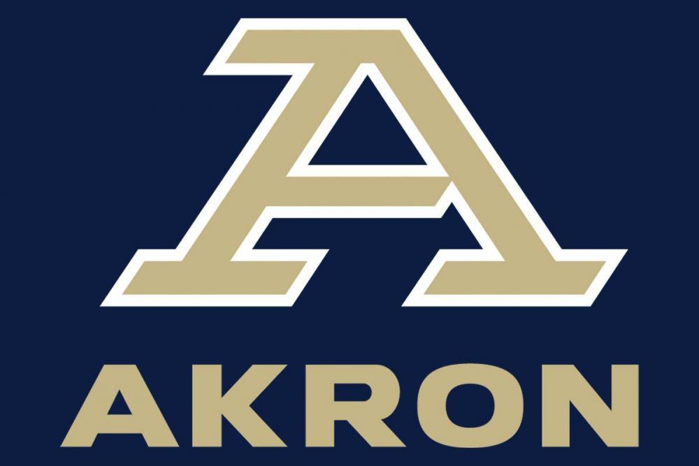
They updated the OSU logo in 2013, but it's still not great. The block O alone is just too basic and can easily be mistaken for Oklahoma or something by casual fans. My hope is that after a few years people will start recognizing the "A" logo as Akron, and the wordmark underneath will no longer be needed. I don't think there are any other blue/gold schools that use an A logo or start with an A. So we already have that going for us. It's officially been added to the SportsLogo database and I have to say it looks pretty sharp when compared to other logos. I really have gone 180 in my feelings toward it. Each day I feel like I like it even more.1 point
-
All hail the blue and gray.1 point
-
Funny you bring up OSU. The block is classic but the shoe horned "Ohio State" just sucks-- looks terrible and weird. Totally distracting. They have all the branding and marketing money in the world and 80 years of brand heritage and STILL felt the need to tell people who they are. The lesson to me is don't screw up the iconic part of your visual identity- instead, keep it clean but include the descriptor where necessary. Hence the A + Akron works much better than the block O with the name.


 1 point
 -
As far as longevity goes, tOSU have used the block O with changes in how the colors have been arranged for 64 years, and is one of the most recognizable brands in the world. Iconic. Yeah yeah I know, we hate the Worthless Nuts. But, we want our university to be successful, sometimes you have to look at what's worked for other brands, including our rivals. In other words, DON'T MESS WITH IT FOR AWHILE. If ever.1 point
-
They are going to repaint the floor. I hope they stick with the design shown. That is the most gorgeous basketball court mine eyes have ever seen 😍😍1 point
-
Great post. I LOVE the new A. It strikes me as an adult logo. Grown up. Serious. Big time; not at all minor league.1 point
-
As is Caden Clark!1 point