MDZip
-
Posts
5,877 -
Joined
-
Last visited
-
Days Won
70
Content Type
Profiles
Forums
Events
Gallery
Blogs
Everything posted by MDZip
-
Going to lose a lot of fine players and people after this season, but they've given us a heck of a ride.
-
Why not? Seems like 6, 7, 8 years in college is the norm now. Glad to see that Groce continues to recruit quality human beings for athletes.
-
I do not. A good coach for sure. Top 10 in the nation? Not a chance. His half brother is a better Coach.
-
I think I might have the perfect guy for the Hawks to hire though - Cal State Bakersfield's assistant basketball coach faces a hefty rap sheet of 11 criminal and misdemeanor charges, including felonies such as pimping. 😳
-
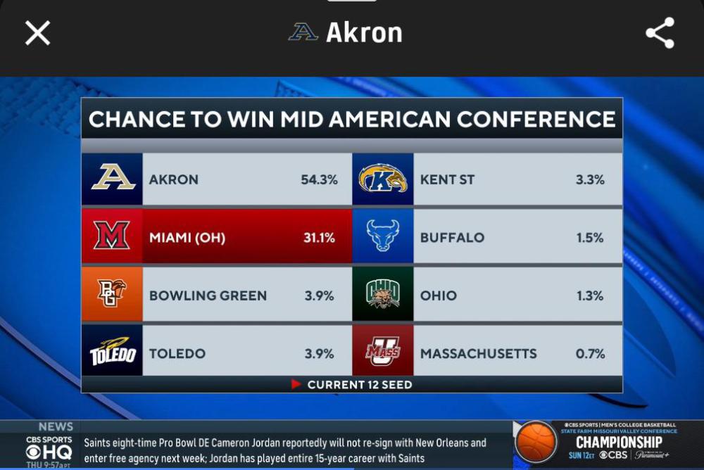
Nice find on this one. Five Akron players in the top 12 in the MAC, they also have an offensive adjustment metric where Akron still has five players in the top. And Tavari is listed at number 34 in the entire country in that metric.
-
He should - he's still alive.
-
And the Zips would not be getting nearly the attention if they were having the season they were having and Miami was just having an average season. I would think the MAC would be happy to have Miami lose the final and potentially get two teams in. Historic seasons fir conferences like the MAC don't come along all that often. BTW, no matter what happens on Friday the Zips conference record over the last 2 years will be better than Miami's.
-
Captain Kangaroo.

-
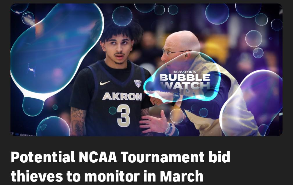
Lots and lots of attention being focused on the MAC right now. I love it, especially because everybody is talking about Akron really being the team people should be paying attention to. CBS Sports discussion on Miami's at large chances since they think Akron will win the tournament. And an article on bid stealers since they make the argument if Akron beats Miami, Miami might still be an at-large team so that would be a bid stealer. Although that's not a huge upset because Akron's pretty damn close to being tournament worthy on their own. Zips are the face of the article.

-
True, but just ask him about Alderaan.
-
This is the most interesting season the MAC has had in years and Miami and Akron are the reasons why.
-
Here is the article and here is the part on the MAC. Mid-American Conference Saturday, March 14, 8 p.m., ESPN2 Borzello: Akron Lunardi: Akron Medcalf: Miami (Ohio) Why Akron will win: It feels morally wrong to pick against Miami becoming just the fourth team since 1991 to enter the NCAA tournament with an unbeaten record, but Akron took the RedHawks to the wire on the road on Jan. 3 and hasn't lost a league game since. Zips coach John Groce has won three of the past four MAC tournaments, and Tavari Johnson is a star in the backcourt. -- Borzello Why Miami will win: The only undefeated team in America just keeps winning. There are debates in the bracketology world about what the RedHawks would have to do to get into the field of 68 if they suffer a loss in the MAC tournament. Yet, they've won conference games by a landslide as well as games by a hair, making them equipped for whatever predicament they'll face in Cleveland. -- Medcalf My take: Yeah they've won some games by a lot in conference. Have you seen the bottom of our conference?
-
CBS Sports is really kissing the Miami ass now. They have a video explaining how last season's title loss has motivated them for this year. Except that they called Akron a bid stealer last year for beating Miami when Akron was the number one seed. CBS sports, you can kiss my ass now. Redhawks Redemption Song: How A Championship Game Loss Set Up Historic Season Stream of General Videos - CBS Sports
-
So odds are very high that in their last season in the MAC, NIU is going to finish last in basketball and only didn't finish last in football due to the grace of UMass.
-
I want Miami to finish undefeated now. When there was still a chance for the Zips to get the first seed, I was hoping for two losses. Now that there is no chance I want them to finish undefeated so that MAC Championship will be that much sweeter.
-
25-5 is akron's best start to a season ever.
-
Evan Mahaffey - 13 rebounds - so far.
-
And his defense has been outstanding.
-
Tavari is so darn unselfish.
-
If Sharron decides he's a shooter again, look out. 😊
-
I think Evan guarded five different players on the last possession. 😊
-
So that you can see whether or not there is a mother more lucrative Mountain over that one.
-
Thank you, now I can root wholeheartedly tonight. 😊
-
The one advantage to changing our logo every few years is lost in this scenario, if they're going to put our name right below it.
-
And we didn't have a couple of guys named Mahaffey playing.