Leaderboard

Popular Content
Showing content with the highest reputation on 05/10/2022 in Posts
-
I've heard we have a QB coming from an FCS school. He is good, but not head and shoulders better than Irons. I've been told he will be behind Irons because Irons has a far better grasp of the offense JoeMo wants to run. The opinion of my source is that this new QB is servicible, but we need Irons to be the man. Wish I had specifics.5 points
-
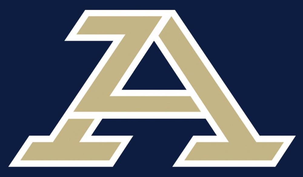
The designer Joe Bosack made some comments on a design board I thought were interesting. He did the original logos back in the 2000s and gave some insights. He also confirmed that the new logo takes small touches from all of the Zips previous logos. Serifs from the motion and oval A. Sharp edges and angled lines from the most recent logos3 points
-
3 points
-
I didn't design anything. I was just part of the focus groups that gave feedback to the real designers. The same group that gave us the Z and Fear the Roo.3 points
-
Anthony Whigan is now Twitter official.2 points
-
I'll guess at one time a good edit had the A and Z separated more like this logo separates the b and m. The brewers logo was probably an inspiration of that edit. Edit 4103
 2 points
 -
I'm obviously in the minority, but I like it quite a bit. I hope they don't stray too far from it for many years. My fellow college football fans I grew up with noted long ago that you could always tell the "powers" from the "also rans" by how often the uniforms changed. The best teams almost never changed them. Let's allow the excellent assembly of coaching talent we have to enjoy a long run with the "A and hidden Z" or "zipped A" motif.2 points
-
Top Drawer soccer is showing a new class of 2022 recruit in this week's recruiting roundup https://www.topdrawersoccer.com/club-soccer-articles/sima-recruiting-roundup:-may-9-15_aid50796 From what I can find, Mansour Diop was part of the Philadelphia Union YSC academy for 2021 (Mitchell Budler was also part of that group) Mansour Diop originally committed to play at Penn State for the fall of 2021. However, he elected to stay as an amateur and play for Union 2. Diop is a 6'5 center back. Originally from Senegal. Moved to the US at age 14. Welcome, Mansour Diop to zips nation.2 points
-
Came here to post the same thing. Awards and Honors: 2021 HERO Sports Sophomore All-America 2021 Second Team All-OVC 2021 OVC Preseason Offensive Player of the Year 2021 Preseason All-OVC 2020-21 STATS Perform Jerry Rice Award Finalist (6th) 2020-21 OVC All-Newcomer Team 2020-21 OVC Co-Freshman of the Year OVC Offensive Player of the Week: March 16, March 23 (2020-21); Sept. 19, Nov. 7, Nov. 14 (2021) OVC Newcomer of the Week: Feb. 23, March 16, March 23, April 6 (2020-21) STATS FCS National Freshman of the Week: March 15, 2021 OVC Commissioner’s Honor Roll (2020-21) Dean's List (S21) Athletic Director's Honor Roll (F20)1 point
-
This is more what they should have gone with. But I still like the new A overall.1 point
-
He said "B.M."1 point
-
Reminds me a lot of this only not as obvious. Work on differentiating the A from the Z.
 1 point
 -
I am underwhelmed. If I were to walk around where I live (Washington, DC area) with this new A logo, who would I be promoting? American University, Appalachian St, Adelphi, Acadia University, Agnes Scott College, Aichi Bunkyo University, Albion College, Alfred State College, Augustana College? When I walk around D.C. with my Z hat, it never fails....people love to say "Go Zips"! There is no confusion what the Z stands for! Fukit ...let's win some games........I'll keep my "Z" stuff, it's unique.1 point
-
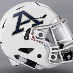
It makes me think of EA Sports for some reason.... and the A in Army.1 point
-
I think I'm past the anger and depression stages, landing on acceptance. It is what it is at this point. Nothing we can do about it and hope the logo sticks around long enough to become recognized as "Akron." Having success on the field or court will go a long way. I absolutely hated the Guardians logos, but bought a hat the second they went on sale. The Browns logo is literally a piece of equipment and I own plenty of gear with that dumb helmet on it. The Cavs have had dozens of logos in the past 10 years and none are anything special. Collectively NE Ohio has some of the worst branded sports teams. We had some nice logos, but I can agree with the inconsistencies and "gimmicky" style. The new brand definitely has the feel of something that could have been used by a big time college for decades and should stand the test of time.1 point
-
1 point
-
1 point
-
Welcome, Mansour Diop to Zips Nation!!! Very intriguing prospect!1 point
-
I was a part of this process. The driving factors in the design were as follows. 1. Consolidation of the 8 different logos that are currently in use. 2. Coming up with a clean simple logo that would tie in with the word Akron. 3. Creating a Font that was unique and could be trademarked. (It has been) Even the font in the word Akron was trademarked. Expect to continue to see the use of several of the old logos in various situations to add effect. The word Zips with the stylized Z on home uniforms and Akron on away uniforms. But the main emphasis will be the A and the word Akron.1 point
-
Like both of these better because of emphasis on Z because it’s unique to our University of Akron Zips & makes sense1 point
-
Looks decent on the JAR court and InfoCision Field. I'll give them credit there.1 point
-
I posted my thoughts on a graphic design board and I think that the logo may be worth saving after seeing different applications. It's not terrible. The problem is that 99% of the time it seems like the generic "AKRON" font is right beneath it. It's unnecessary and amateurish. When the A is alone, I can definitely see myself buying that hoodie. Maybe after 5 or so years of the new logo, people will know it's Akron and we won't need the label underneath anymore.1 point
-
Nothing like another boring, bland and generic A logo to add to the already thousands of boring, generic A logos that will never stand out or stand up to strong A brand logos like Atlanta, Alabama etc… I just can’t fathom how people sit around a room and say yep - that boring and generic logo that nobody outside of a small city, of which I bet less than 25% would be able to tie that back to the local university. However, there is exactly one university in division one sports that has a team name that starts with Z. Truly in a market by itself and they couldn’t find a way to update that? Clearly - if you aspire to be in business and/or marketing - they’re telling you that you are absolutely picking the wrong school to attend. Pretty embarrassing to be honest.1 point
-
So are we going to get tossed from InfoCision for throwing out the "Z" hand gesture now? Do we need to switch to an "A"? Hope not. Z forever! Free the Z!1 point
-
The logo is fine. The old ones were fine. The issue was consistency imo. Some teams had script, some had the Z, baseball has their own A. It will just be good to have everyone wearing the same logo I think.1 point
-
Meh. Would do well to have a secondary logo incorporating the roo imo1 point
-
Thanks Clark for breaking the news to us and posting! Not going to lie, I like it a lot more than I thought I was going to. Yes it is an "A", but at least the font is different from the other schools using it. I will say, the university needs to stick with it and stop trying to get different logos going every few years. If you want the brand to be recognized, you have to stick with things for a while for things to catch on and build some type of legacy. Just my opinion. Do I loved it? No. Do I like it though? Yes!1 point
-
Not sure I could be more underwhelmed. I guess I won't be running out to buy new apparel. 🙄1 point
-
Eh. Cool video though.1 point
-
247 has him in the transfer portal1 point
-
St. Vincent St. Mary1 point
-
From off of the WBB Blog -- the best site BTW I've found for updated recruiting info -- We have a second 2023 commit. Coach Jackson has always done a good job of reaching out and receiving commitments early.1 point