Leaderboard


Popular Content
Showing content with the highest reputation on 05/09/2022 in all areas
-
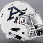
That helps because It probably would be better if the Z was more apparent. I wonder if something more subtle could achieve the same effect?
 4 points
 -
Edit 4102
 4 points
 -
Thanks Clark for breaking the news to us and posting! Not going to lie, I like it a lot more than I thought I was going to. Yes it is an "A", but at least the font is different from the other schools using it. I will say, the university needs to stick with it and stop trying to get different logos going every few years. If you want the brand to be recognized, you have to stick with things for a while for things to catch on and build some type of legacy. Just my opinion. Do I loved it? No. Do I like it though? Yes!4 points
-
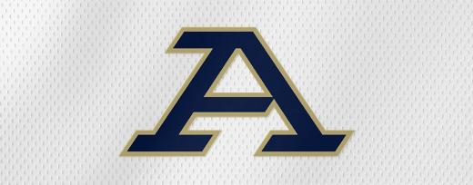
I was a part of this process. The driving factors in the design were as follows. 1. Consolidation of the 8 different logos that are currently in use. 2. Coming up with a clean simple logo that would tie in with the word Akron. 3. Creating a Font that was unique and could be trademarked. (It has been) Even the font in the word Akron was trademarked. Expect to continue to see the use of several of the old logos in various situations to add effect. The word Zips with the stylized Z on home uniforms and Akron on away uniforms. But the main emphasis will be the A and the word Akron.3 points
-
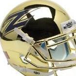
Looks decent on the JAR court and InfoCision Field. I'll give them credit there.3 points
-
The new logo is having a rough time on social media. Almost unanimously disliked. The only positive comments are from people employed by the university. Doubt the people in charge care enough to listen though. Their opinion is probably just "People don't like change, they'll get over it." The problem is that most of us have been around UA much longer than them and the school means more to us.3 points
-
Awesome to see someone snap up the new logo as their Avatar! 🦾
 3 points
 -
Announcement video-3 points
-
I'm jonesing for any updates whatsoever And, btw, Pete Nance would be a fantastic get and perfect fit. Maybe he'd like to come home & play in front of friends and family while picking up a master's? 🙏🤞3 points
-
No. So far they only have the blue hoodie and blue t-shirt. In hindsight the weather seems to have broken so I probably should have just gotten the t-shirt 😂2 points
-
It’s growing on me, i know my thoughts don’t mean anything but if they made the top of the A come out a little further to the left & emphasized the Z & maybe used a different color for the Z it could be special. Idk, maybe I’m reaching2 points
-
I sat back and just stared at that thing. Did someone have a 1p tee time ... bang it out in the morning and hit the links? I see "I" and "A" before I see "A" and "z." There is NOTHING about that design that makes me want to run out and buy Akron gear ... NOTHING. While trying to kill time on Tuesday nights in November, I can picture national broadcasters telestrating "Now ... if you look very closely, you'll see a lowercase "z" incorporated into Akron's new ugly-Azz logo." Let's Go Parallelograms! Long live Chief Wahoo!2 points
-
Looking forward to seeing the version with the ⭐️ for our Men's Soccer National Championship.2 points
-
Top Drawer soccer is showing a new class of 2022 recruit in this week's recruiting roundup https://www.topdrawersoccer.com/club-soccer-articles/sima-recruiting-roundup:-may-9-15_aid50796 From what I can find, Mansour Diop was part of the Philadelphia Union YSC academy for 2021 (Mitchell Budler was also part of that group) Mansour Diop originally committed to play at Penn State for the fall of 2021. However, he elected to stay as an amateur and play for Union 2. Diop is a 6'5 center back. Originally from Senegal. Moved to the US at age 14. Welcome, Mansour Diop to zips nation.2 points
-
Nothing like another boring, bland and generic A logo to add to the already thousands of boring, generic A logos that will never stand out or stand up to strong A brand logos like Atlanta, Alabama etc… I just can’t fathom how people sit around a room and say yep - that boring and generic logo that nobody outside of a small city, of which I bet less than 25% would be able to tie that back to the local university. However, there is exactly one university in division one sports that has a team name that starts with Z. Truly in a market by itself and they couldn’t find a way to update that? Clearly - if you aspire to be in business and/or marketing - they’re telling you that you are absolutely picking the wrong school to attend. Pretty embarrassing to be honest.2 points
-
I like the video more than the logo. The logo is...meh. I won't be rushing off to the bookstore.2 points
-
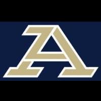
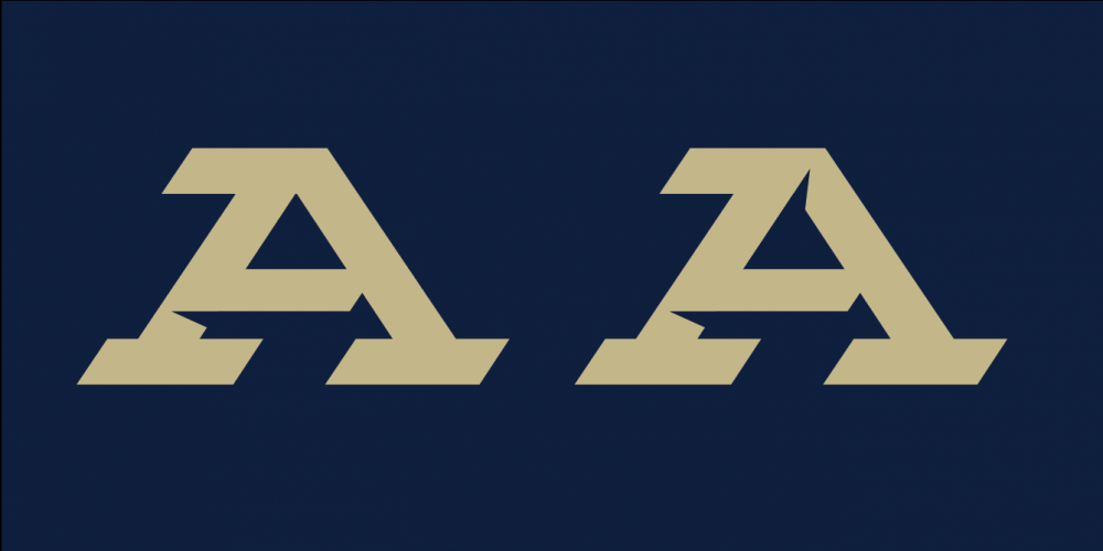
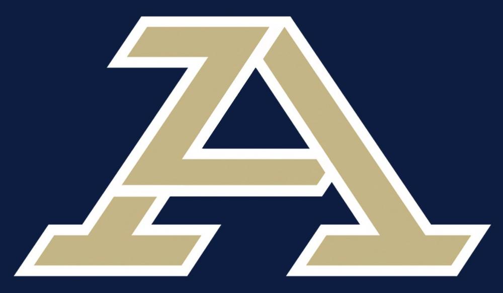
Here is is. Just released to faculty and staff.
 2 points
 -
I'm obviously in the minority, but I like it quite a bit. I hope they don't stray too far from it for many years. My fellow college football fans I grew up with noted long ago that you could always tell the "powers" from the "also rans" by how often the uniforms changed. The best teams almost never changed them. Let's allow the excellent assembly of coaching talent we have to enjoy a long run with the "A and hidden Z" or "zipped A" motif.1 point
-
Court looks sweet, helmets look nice, field looks okay. It’s been a roller coaster but the logo is fine and at the end of the day, I’m Akron til’ I die. Time to order some merch! Go Zips! #1Akron1 point
-
Those were actually tweeted out by the basketball and football accounts, along with white and gold football helmets. I'd assume they are probably official.1 point
-
Initially I didn't like it. The more I look at it the more I like it. Not exactly over the moon though. There is some flexibility to do different things with it so that's good.1 point
-
If this was done for free---then the University got their $ worth1 point
-
Looks good on the court. I don't hate it, just don't love it. Would have liked to see a secondary logo or two released also. Pitt came out with a new panther when they did theirs and its gone really well, was hoping for a similar thing here with the roo1 point
-
Brand streaming had to happen. The end product is "meh" and people will continue to use the other 8 logos because the new one is so lackluster. It's too bad they are minimizing the emphasis on "Zips" which is a very unique differentiator.1 point
-
Wow, I guess I was wrong - someone did already try to mimic our new logo. I guess we'd better send them a cease and desist letter right away 😀 Honestly, it's probably good we got ours trademarked before releasing it to make sure we're in the clear..1 point
-
...and when the Z came out most hated that too.... People don't like change. I think its a great logo. An Akron A makes sense (love the subtle Z incorporation). Look at the Division I logos and they are predominately Letters representing the name of the school OR a picture representing the mascot. None are a letter representing the mascot alone. The stand alone Z did nothing to identify The University of Akron to me. Go AKRON!!! Go ZIPS!!!1 point
-
I'm not thrilled by the new logo, but at the same time I think it makes a lot of sense. Why "A" over "Z"? Because they are trying to strengthen the connection between the university and the city. Both are Akron. Only the university is Zips. I do agree that some subtle shading or outlining to bring out the "Z" would help in a couple of ways. It is distinctive in that it is not similar to other logos (well, not too much, anyway). Once all the teams are using it and get some exposure, people will recognize it as "Akron". A logo can be effective without being visually great (see Nebraska's "N"). It is vitally important that the university uses it consistently for a number of years. That is how effective branding works. SO GLAD they kept the golden gold! And don't forget Zippy!1 point
-
You can design the coolest logo on planet earth, it does not mean the client will select it. More than likely, they will not.1 point
-
If the hope is landing Pete Nance, I'm sorry to tell you you're going to be left disappointed. I wouldn't be surprised if 20 P6 coaches have already reached out to him.1 point
-
I like the concept of blending the Z into the A, but the logo left me unimpressed1 point
-
The summer of '09, Pete and Larry Jr. participated in the Akron summer basketball camp. Larry Jr. was noticably on a different level than his age group (high school), and Pete was the same way (elementary school?). One of the nicest families you'll ever come across. Had the pleasure of actually playing on Larry Jr.'s 3 on 3 team (we won the camp tournament), and they trained at Springside where I took tennis lessons so I ran into them quite often. Would love to see one of the Nance boys wear the Akron Blue & Gold.1 point
-
He did, and I image he did it with one hand tied behind his back. It IS better than Western's rebrand, though.1 point
-
Well said. It’s been stated that UA alumni and fans were consulted, well it must not have been many, or ones that actually care. Joe Bosack has designed some cool logos, this ones is lazy and boring and most importantly, it doesn’t say AKRON to me at all, in any way.1 point
-
https://uakron.spirit.bncollege.com/ 😐
 1 point
 -
On one of the Facebook pages there’s a link to the bookstore that just has a navy blue T shirt or hoodie right now.1 point
-
“The Athletic” has an awfully similar look1 point
-
Way to be the first to jump on the new logo as your Avatar, @Zip_ME87! 🦾1 point
-
Do I love it? No. Do I like it though? No. Is it okay? Sure. Is it better than Script Akron? Absolutely? Seems to be a lot of disappointed people on social media. A nice secondary Kangaroo or Z logo would have helped bring the whole brand together. "Unifying" a brand doesn't mean you only can have one logo. It just means that you have a main primary logo that is used most often, with others sprinkled in to expand your brand.1 point
-
Fortunately I was expecting to be underwhelmed so I don't really care. It's a fine A. But if you showed this to anyone who either didn't watch the video or didn't know anything about Akron, the Z gets completely lost. I like the idea, but a more prominent Z or the Z logo were accustomed to being included in this design would be much better. Design was done by Joe Bosack's company, who is the creator of the MAC shield logo and I believe the A-Roo as well. I would have expected better. Oh well.1 point
-
I don't love it, but I don't hate it. And I'll do exactly like they want and use it as an excuse to buy some new zips gear. Got a couple hoodies that need retired.1 point
-
Just noticed that lol. Thanks for bringing it up.1 point
-
..and another.
 1 point
 -
Freeman was in lot9 prior to the spring game and promised he’d be at UA for 2 more years. But only if the new primary logo doesn’t suck. No pressure, Guthrie.1 point
-
I do agree that most people know of the Akron Zips, so the Z works. Unfortunately I don't think the higher ups at UA feel that way.1 point
-
Might want to double check that…. Seems they’re having their best season ever and have beaten Michigan, Pitt and Wright State (4 times).1 point
-
Like others I've seen the proposed new logo. I can't say much about it because I gave my word that I would give feedback, but not disclose the design. I'll offer these comments though. First, the process is professional and in depth. This goes beyond sports and seeks to unify UA's branding across all media sources. We have too many logos and we need to standardize on one. Second, a decision will be made soon. We are talking days here, not weeks. Third, there are many different constituencies that have been consulted: faculty, alumni, community (fans), businesses, media consultants and board of trustees. All have opinions. None are overwhelmingly in favor of one particular design. In short, expect many people won't be happy. What emerges will be unique and have the potential to become iconic. Fourth, my favorite, the Z, does not say Akron and that is a concern. There is some history here that I can't go into, but the bottom line is that the word Akron or an A is the focus right now. Script Akron is recognized as needing work, but it is considered valuable and it will be on some uni's as a secondary logo. The same is true of the Z. It will not be primary, but in certain uni schemes it will appear. That being said the new logo will be primary for all uniforms. Finally, whatever is chosen it seems many on this board will not be happy, based on previous posts. The U can't let that paralyze them and be afraid to make a change. Months of research and consultation has gone into this decision. We need to solidify our branding. You might not get what you want but this too shall pass. If we keep winning and have an identity that means Akron, we will be OK.1 point
-
Which are two of the most unique nicknames/mascots in college athletics. Utilize that.1 point
-
1 point